Sunday 12 May 2013

Genre analysis of Synopsis


Analysis of my synopsis through theories of genre

All films fit into a genre category, within this, they may also fit into sub-genres. For example, my film belongs to the Horror genre, of which it belongs to the sub-genre ‘slasher’. There are different ways in which the genres can be interpreted.

The first is descriptive, this is a term used to explain how we view film as belonging to a certain category or a mixture of categories. Most films share attributes with other films that are categorised similarly and thus analysed accordingly. Descriptively, our film belongs to the slasher genre as it portrays the typical group of teenagers being killed one by one by an antagonist who seems to have no plausible reason to be killing. It also fits many other codes and conventions of the slasher genre. Other films that also fit this description are ‘Halloween’ and ‘The Texas Chainsaw Massacre’.

Slasher films are formulaic. Generally they are very similar in that they incorporate a group of friends. In our film ‘Eve’ the group of friends consist of the typical ‘final girl’ Nora. She seems to be the quieter one of the group and her clothes reflect her slightly boring nature. On the other hand Crystal who is the typical sexually active girl of the group is dressed revealingly and wears black which symbolises death. They can be seen as binary opposites within the film.

Also as a convention of slasher films we have a benefactor this is mentioned in Propps narrative theory, a tired looking man in trampy clothing who warns the teenagers about the danger in the woods. In other films such as Halloween the benefactor is used as a red herring to keep the audience in suspense.

However our film does break conventions in the way our antagonist or ‘monster’ is a little girl as opposed to the usual masked villain we see in films such as ‘Texas chainsaw massacre’ and ‘Halloween.

Functional viewing refers to the way in which people see film in relation to contemporary life. “Collective expressions of contemporary life that strike a particular resonant chord with audiences” (Experience and meaning in genre films B.K Grant) essentially, what is the audience gaining from the experience of watching genre films. This begs the social questioning we see in particular genre films. For example, ‘what frightens us?’ which is the question associated with horror and slasher films. In our synopsis the villain or ‘evil force’ is a nine year old girl. This is important as it differs from the usual masked large man we see in other slasher films such as ‘The Texas chainsaw Massacre’. Women and young girls in particular are often seen as weak and submissive in the media, as a reflection of our undeniable patriarchal society. Yet in our film ‘Eve’ proves to be even more powerful than the alpha male of the group. This makes the audience feel uncomfortable with the fact someone who they’d expect to be innocent and harmless is in fact a ruthless killer. This begs the question-who really is safe? This seems to go against the norms of the patriarchal ideology however the male audience may relate to her as she doesn’t show any overt femininity.

Eve reflects the monstrous feminine in our film and it could be argued that she represents the innocence of childhood being lost as a reflection of the teenagers transitioning into the time of their sexual awakening. As the teens begin the point in life where they explore their sexuality, Eve is a harsh reminder of what happens when innocence is lost. Like other films such as Halloween where the killer kills a women who has been sexually active and the innocent girl lives, our film is subliminally sending the message ‘do not have sex’ as it has resulted in the killings of the teenagers. Eve represents a shattering of innocence. There are other examples of this in film such as, ‘Hard Candy.

As a producer, genre films are often a safe bet as the audience for them already exist. Audiences are familiar with particular categories and so chose them according to what they expect from them. We already know there is a fan base for horror/slasher films as there are many websites and magazines in appreciation for the genre e.g. Fangoria. This means we know there will be sales for our movie and we already have a rounded image of our target demographic. To do this with my film I must look at similar films to mine and take account of their sales and audience reviews.

Orphan, which also features a little girl who is not as innocent as she seems claimed:

Opening Weekend:

$12,871,483 (USA) (26 July 2009) (2750 Screens)

Gross:

$41,573,740 (USA) (4 October 2009)

Considering my budget will be much lower, I cannot rely on these statistics however it shows us the possibility of making a profit high and there is an audience who enjoys this sort of narrative.

Within my film intertexual references must be made in order to attract an audience satisfaction or sense of nostalgia. The first girl to die has been named ‘Crystal Lake’ this is also the name of a setting in ‘Friday the 13th’ which was also a box office success.

According to Frank McConnell, since films reflect society, they will always involve these kinds of typical events.

The King- Establishing the state ‘the epic’
The Knight- Consolidating the state ‘the adventure romance’
The Pawn- Trapped in the institutionalised state ‘the melodrama ‘
The Fool- Responding to the madness of the state ‘the satire’

Apocalypse- The collapse of the state which leads to a new beginning (there is no single hero)

The film Eve includes aspects of ‘the pawn’ category as the teens feel as if they are trapped in this living nightmare. They cannot seem to escape her wrath throughout the film. However when read into deeper we see that our film may also reflect aspects of the fool genre as the madness of Crystal being sexually active, which is seen as negative in our patriarchal society is somewhat ‘fixed’ by Eves killing of the teenagers. She is essentially restoring the society to a patriarchal ideal.

Tuesday 7 May 2013

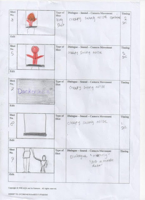
Storyboards


This is a link to the animated storyboard we produced in order to get a feel of the way in which the trailer would work. As you can see there have been some adjustments in between this storyboard and the finished trailer. This is due to adaptions being made in order to create a strong sense of narrative within our trailer. The music used was chosen as it gives a clear sense of the genre, this was also adapted by the final edit.


Also here are some pages of our drawn storyboards with annotations and comments on the right hand side.


Sunday 5 May 2013

Q4) How did you use media technologies in the construction and research, planning and evaluation stages?

There are many ways in which I have used media technologies to aid the production of my media texts. For the magazine front cover production and the poster I used mainly Microsoft publisher to put together the page because its features are easy to understand and fairly time effective. However for image manipulation I used adobe photoshop, this is because I required filters and certain manipulation features that were not available on publisher. For the creation of our trailer I used serif movie plus because it enabled us to edit our footage fairly easily.

As a way to plan and brainstorm as a group, we created a facebook group in order to share ideas and information. It also acted as an aid to organise cast and crew for filming dates.

When conducting our audience research i used the site questionpro to create a questionnaire.
After creating a 20 question survey we distributed it using social media sites such as facebook, twitter, blackberry messenger etc. the use of these sites proved very useful as we reached a large amount of respondants in the period of around a week.

 When i received my results, i decided to present them in a more aesthetically pleasing way, in order to this i entered the data into Microsoft Excel's chart wizard.


 This is the chart wizard, it allowed me to chose what type of graph to display my data in, it also has features to enable you to rename sections of the chart and recolour them.
The type of chart i used depended on what type of data i had collected. for example for questions where there was a larger range of responses I may have chosen to use a bar chart as it would have been more difficult to interpret a wide range of information of a pie chart or something similar.


When researching and analysing existing texts 'Google' proved to be very useful. using the 'advanced search' feature i was able to segregated the information i needed to aid my construction. Using 'Youtube' i found trailers for films such as 'Dead Mans Shoes' and 'The Shining'. The fact i was lucky enough to have access to these platforms means that i was able to put together my research fairly quickly whereas before the times of the internet i would of had to conduct research using local library facilities which would have taken much longer.

Adobe photoshop is a more professional software and requires time and patience in order to get the outcome expected. As a class we faced difficulties with the soft wares used such as adobe photoshop and serif movie plus due to the capacity of the hardware and the servers being very slow. However after many attempts I was finally able to create 3 professional standard media texts.

One of the main images I had to manipulate was the main typography of our film. 'Eve' is written in what can be seen as a 'chalk on blackboard' style. This reflects that our film is about a child. In order to create this image we used the site 'Dafont.com' and chose and appropriate font then print screened the page and isolated the title we created. Then we opened the isolated title image in adobe photoshop and used a feature that made the image negative. So instead of black writing on a white background we now had white writing on a black background. This meant some of the writing outline appeared pixelated so in order to fix this I erased the outline pixel by pixel using the eraser tool until I gained the desired finish.
Then, to give more of a sense of the genre i created a blood red shadow of the typography by copying the image then rotating and stretching it at the required angle. The effect of this is that the white innocence has a reflection of red evil and danger essentially.
When creating our trailer i used Serif Movie Plus. This proved to have its issues as our school computers did not have a wide enough capacity for it to run smoothly. Although we could drag clips onto the timeline easily and put together sequences well. it was difficult to playback what we had edited as it seemed 'jittery' and we could not get a clear idea of the pace of the trailer till we had exported the file and watched it using windows media player. However, Serif Movie Plus is an excellent choice for editing purposes as it is fairly easy to get to grips with and there are many good features we used in order to get our trailer to a good standard. Within our trailers there are shots that are black and white, this was done by clicking the required shot then going to effects and dragging 'Grayscale' onto the shot. We also sped up and slowed down shots by going to properties and typing in how much faster or slower we needed the running time to be. We also discovered by overlapping shots on the timeline it created a 'fade' effect and we could blend shots into each other as well as fade them in or out.


One of the main technologies we used was of course the film cameras. This required some preparation time in order to assure that each member of our group was familiar with things like how to change the focus and iris of the camera, how to set up the white-balance, and how to check that the audio is working. 


Q3) What have you learned from your audience feedback

When first creating my magazine front cover and poster templates i decided to show a focus group, consisting of teenage horror fans, the different styles as well as asking them to pick one they preferred. I also conducted individual interviews in which i used a 'semi-structured' style in order to gain quantitative and qualitative responses. Some examples of responses were:

'I think the red and black are good colours to use for a horror poster as you can tell its horror straight away'- This showed me that the audience were familiar with the conventions of horror films and they understand the connotations of these colours for example red has connotations of blood and gore and black has connotations of death.

'It might be better to use a closer shot of the killer so the page looks more full'. The shot I did use was a medium shot and although it was advised to go for a close up i purposely went against this as i wanted the red coat to be clearly visible in the poster and magazine front cover as it is iconic throughout our film.


Deciding I needed more insight into my target demographic I created a questionpro.com survey. The website enabled me to ask both quantitative and qualitative questions. I found from this that my survey was taken by mostly males which seems to point at the idea that the horror genre in genre as well as the slasher genre in particular seems to have a larger male audience. I also found that the majority of respondants were 15-20 year olds, however it might be worth taking into account that this may just be the nature of respondance rates and perhaps it is just a coincidence that 15-20 year olds are more likely to respond to a survey than the other age groups. This also had implications for the age certificate i gave my film, I proposed a 15 certificate would be appropriate due to the information I found out from my survey. This meant the content I included in my trailer had to be appropriate for this age range.

I also created a link to my trailer on Facebook, allowing people to comment on it about what they thought of the trailer. This also built up a hype for my movie and created an exchange between the audience and my production. The majority of comments were about the tension and how it was built during my trailer effectively. However people mentioned that the first caption slowed the flow of the movie down and creates imbalance within the trailer however it is then regained due to the soundtrack.

At the premier of our trailer we invited around twelve students to watch the trailer and fill out feedback questionnaires. They watched the trailer once and then filled out a questionnaire with set questions which were:
1. What do you think the storyline is?
2. What do you find scariest about this trailer?
3. What do you think about the soundtrack, explain?
4. Does this trailer fit the horror genre, explain?
5. What could be improved in our trailer?


 Here is an example of one response sheet which has been filled in by a student at our premier.
This participant overall enjoyed our trailer and thought it was effective. For the first question we asked what do you think the storyline is? This is an important question as it enables us to see if our narrative has come across to the audience effectively. The fact that this participant has almost perfectly explained the basic storyline shows us that we have achieved this.
 
They also thought the soundtrack was effective in creating suspense and building tension. This assures us that there will be an audience for our film after we have released the trailer. We know that the genre is easily identifiable. This is important as people may chose to watch a film solely based on the genre of it.

Although this respondant did not feel there was room for improvement other participants criticised the storyline, saying it left the audience wondering why the group of friends had gone into the woods. Implications for this may be that next time we would could have a stronger sense of the narrative within the trailer but remembering not to give away too much as we need to keep the audience guessing so that they will come to watch the film.


Narrative analysis of synopsis


Todorov:

Equilibrium- This is shown when the teenagers are walking along a road on a sunny day. They are suitably dressed to match their roles in the storyline so the audience can clearly pick out. 'The final girl', the sexually active friend, the alpha male, the alpha males right hand man, and the gay character. The equilibrium introduces us to the norms of their everyday life. As we can see they enjoy being outside and having a laugh.
Disruption- This is first seen when eve is noted to be gone from the swing. this disruption is what awakened the monster within 'Eve' however it could be said that the disruption actually occurs when the teens start to be aware they are being watched and hunted down. 

Attempt to repair disruption- This is when Tony and Keith plan to kill Eve. Also when Nora attempts to kill Eve
New Equilibrium- This is not seen in our movie as we have left the ending open so as to allow the audience to incorporate their own thoughts as to what has happened. Similarly in Halloween it is shown that Michael Myers has escaped and so the audience is left guessing as to what has happened to him.
Propp:


The villain; this is obviously Eve, who ironically is just an innocent little girl from our first perspective. In horror the villain is often the main character and the narrative is based around them.
The donor (gives the hero some magical object); this is an anonymous person who we do not see throughout the movie.
The (magical) helper who helps the hero in the quest; the friends all act as helpers especially Keith.
The princess (person the hero marries OR a dream or desire which is sought after in the same way); In our story there is no princess or romantic story intertwined however the ‘dream’ or ‘prize’ is there life
The dispatcher (who sends the hero off); This isn’t applicable to our story as there is no quest or mission that the group pursues. However the benefactors warns them NOT to go into the woods 

supposedly trying to send them away from the evil.

The hero/victim; This is Nora. She is the ‘final girl’ of the film who ultimately defeats Eve. She is a typical final girl as she has dull brown hair and the colours she wears are 'grannyish' this may reflect the fact she is the mature one of the group.

The false hero or usurper. This may be Keith and tony who first tried to kill Eve.

Barbara Creed:
The ‘monstrous feminine’ figure in our film is Eve. She is representative of the fear of castration or the ‘mother’ figure according to Freudian theory. However the fact she seems to be strong and not submissive also means the male audience can identify with her. Nora has been made less feminine so 
that the male audience can identify with her and there fear of her being killed or ‘castrated’ is 
reflected in their own fear of being castrated. There are no knives used in the film however Eve's 
presence is enough to strike the initial fear of castration.

Roland Barthes:
Action code: the who of the story is the group of friends who are the potential victims and focus of 
the film. The main setting of the film is the woods, this is a conventional horror location. Its shown in modern times so that the audience can relate to it. Eve has been missing for sometime and when she suddenly appears as a villain we see she has completely changed due to unexplainable causes. Perhaps she was kidnapped by someone evil who influenced her? The audience is left to imagine.

Semantic code: the story will be shown through a narrative viewpoint rather than through any characters, this is typical and will make the audience feel as if they are witnessing these deaths and events without any control over it.
Enigma code: there are many elements of mystery in our narrative, such as, how does Eve kill people without so much as a touch? Where has she been after she was kidnapped? Who will be the next to be killed?

Referential code: this will be shown in the mise en scene, the first girl to die will be overtly sexually promiscuous and dressed stereotypically to the convention.

Symbolic code: this involves connotations and iconography. Such as the character of eve, a little girl whos connotations will be evil and danger and this will be influenced by musical motifs associated with her and close ups of her anger.

Saturday 4 May 2013

Q2) How effective is the combination of your main product and ancillary texts?

To aid the marketing of my film I created both a movie poster and a magazine front cover. My poster would be placed in areas where my target demographic would most likely spend time. Such as the cinema, bus stands and town centres. The aim of my poster is to capture the genre and narrative of my film and briefly exhibit it to the audience to encourage them to watch the film. It is important that the brand identity in all three texts are consistent in order to make the association between the texts easily recognisable.

One way in which I have done this is by using the same main image for both the poster and the magazine front cover. The image is of the monster 'Eve' looking towards the camera in a sinister way wearing a bright red coat. The fact she is addressing the camera directly gives the impression she is 'watching' and 'waiting' as the trailer states. It could be argued that her posture has elements of the male gaze within it as her head is canted which arguably makes her appear more submissive. However the way her head is canted is as if to challenge the viewer to watch this film. Also The position of her head is unnatural and gives the viewer a sense of discomfort and unease.
The red coat which acts as an inter textual reference is visible in both the main text and the ancillary texts. It's somewhat the signature of our monster and is used to note her presence the same way the Michael Myers mask is used in Halloween.

For my magazine front cover I decided to create my own magazine for a number of reasons. One being that horror magazines that were already available seemed to cost around £5 per edition. Due to research I knew that the magazine market was rapidly declining against the rate of inflation and I decided by creating my own magazine I could make it sell better by pricing It at around £2  thus gaining a wider audience. Another reason I decided to create my own magazine is that existing magazines such as Fangoria tend to have a very narrow demographic. Although the use of an existing demographic normally aids low budget productions as the audience already exists. I decided to create a magazine that may appeal to a wider range of people. I quickly realised that magazines such as Fangoria and Scars have many graphically disturbing pictures as there main image. Although this would be suitable for their target demographic it could be argued that they are 'scaring away' other horror fans who may not enjoy the disturbing images on the front. My image doesn't incorporate blood however the direct address eve gives the camera is discomforting enough to allow the audience to  understand  that it is a horror film being advertised.


The main image incorporates Eve wearing the red coat which is iconic throughout the film as a symbol of danger. The forest is shown behind her to incorporate the German expressionism aspect and exhibit her psychological landscape. I used green for my main typography for the 'Eve' story as green has connotations of nature as well as envy. It could be argued that this particular shade of green is reminiscent of the supernatural or aliens. This is symbolic of Eve being supernatural. most of my other typography was either white or black as these stand out best against the other colours. Red was used for obvious reasons it has connotations of blood and danger and also it gives a sense of the genre as red is used often in slasher films. The masthead of my film 'slasher' is written in red and white against a black background. The red characters are capitalised to give a sense of masculinity as slasher is a predominantly male aimed genre. The white 'A' is symbolic of a white chalk outline at a murder scene. This gives the audience a sense of the narrative. The red borders are reminiscent of the 'letterbox' effect used in our trailer. The large left margin in which i have placed my inside stories is similar to the effect used in Hitchcock's psycho poster.This intertextual reference may give the older audience a sense of nostalgia. As an additional incentive I have placed an advertisement for 'Childsplay' posters within the magazine. This may help to bring in customers as they may primarily want the free posters inside.


For my poster i used the same image. This is because i wanted the image to be familiar so that when people see it they know straight away it is for the movie 'Eve'. However the overall tone of my poster is much darker. Using photo manipulation i made the image darker this is important as we do not have a masked assassin like in other popular slasher films such as 'Halloween' and 'The Texas chainsaw massacre' however the picture here shows Eves face hidden almost by shadow which gives a sense of mystery like the 'Enigma code' that Roland Barthes proposed all films have. I then used a black border or 'frame' as it is similar to the letterbox effect i used in my trailer and therefore there is a sense of consistency. I then added the symbols for Warner bros, Film 4, and Dankershein. Warner bros and Film 4 are fairly well known companies and could help to bring in an audience for my film however Dankershein is a company we made up as an independent body which could become better known after the release of my trailer.
The trees behind this image create twisted and abstract shapes which can relate to German expressionism as this is a psychological landscape and is reflective of the little girls crooked mind. the tagline 'revenge is sweet' gives the audience a sense of the narrative and the genre. The audience can now assume that the revenge is being taken out by the little girl as little girls are usually seen as 'sweet'. This gives them a hint as to what the narrative is. Also the word revenge builds association with 'revenge films' which is an element of my slasher film. I chose to do the main writing in white as it stands out well against the darkened background. Also 'Eve' is written in a chalkboard effect which is reminiscent of two things, the first being childhood in classrooms and the second being chalk outlines of murdered people. These two themes of innocence and evil are binary opposites throughout my film. I chose to make this film a 15 because although it is a horror it does not have any gory parts to it which may cause discomfort to the viewer. however if i were to release my film i would have to send it to the BBFC for them to make a judgement as to what certificate my film should be. If it was to be released in the cinema the local councils would have the overruling say on what the age certificate should be. If the film was to be released onto DVD the BBFC's certificate would be legally binding due to the video recordings act 1984.

The companies that will distribute my film are Dankershein and Film4 productions. Both of these are British film companies that will be able to promote and distribute my film. My film is targeted at a niche British audience this is because Slasher films are often targeted at a niche audience anyways and due to my film having a degree of British social realism within it it could be seen that it will be more popular among British people. Dankershein is a small company which will need funding from other companies such as Film 4 and Warner Bros in both production and distribution.


Existing media research - Magazine Front Cover